“Type has always spoken to me in a way that I can’t explain. Though it’s just a bunch of letters on a page, when put together they create feelings, thoughts, stories, even pictures to express something for someone”.
Anatomy of Type.
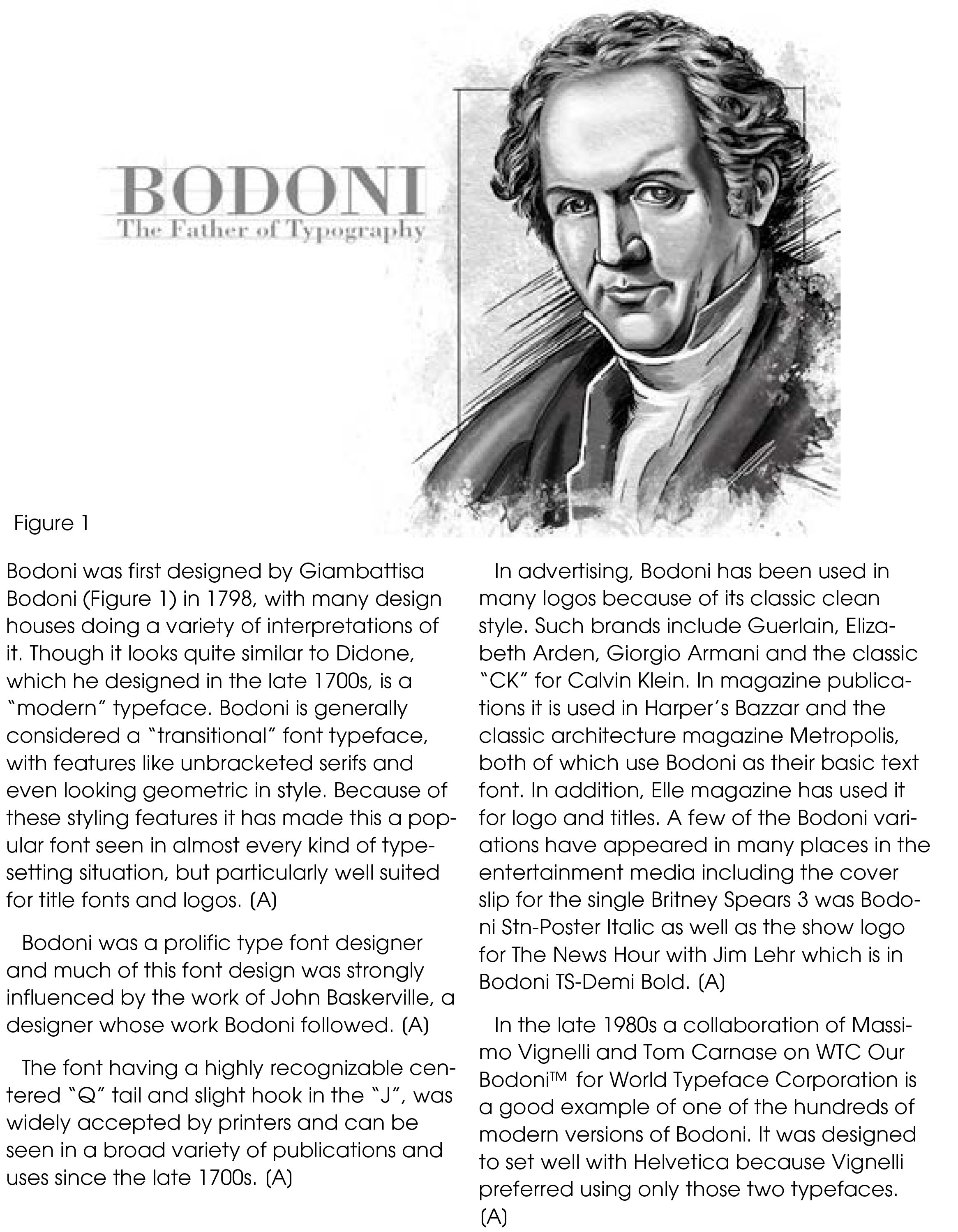
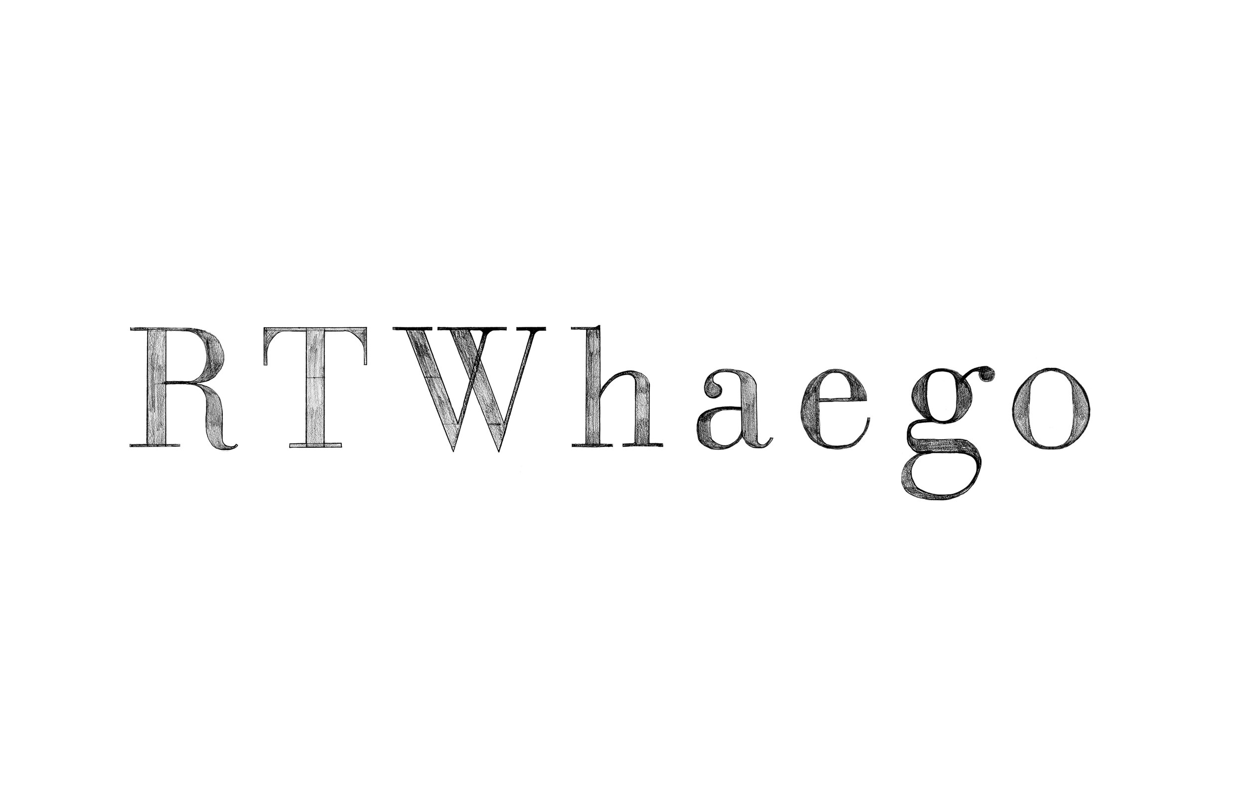
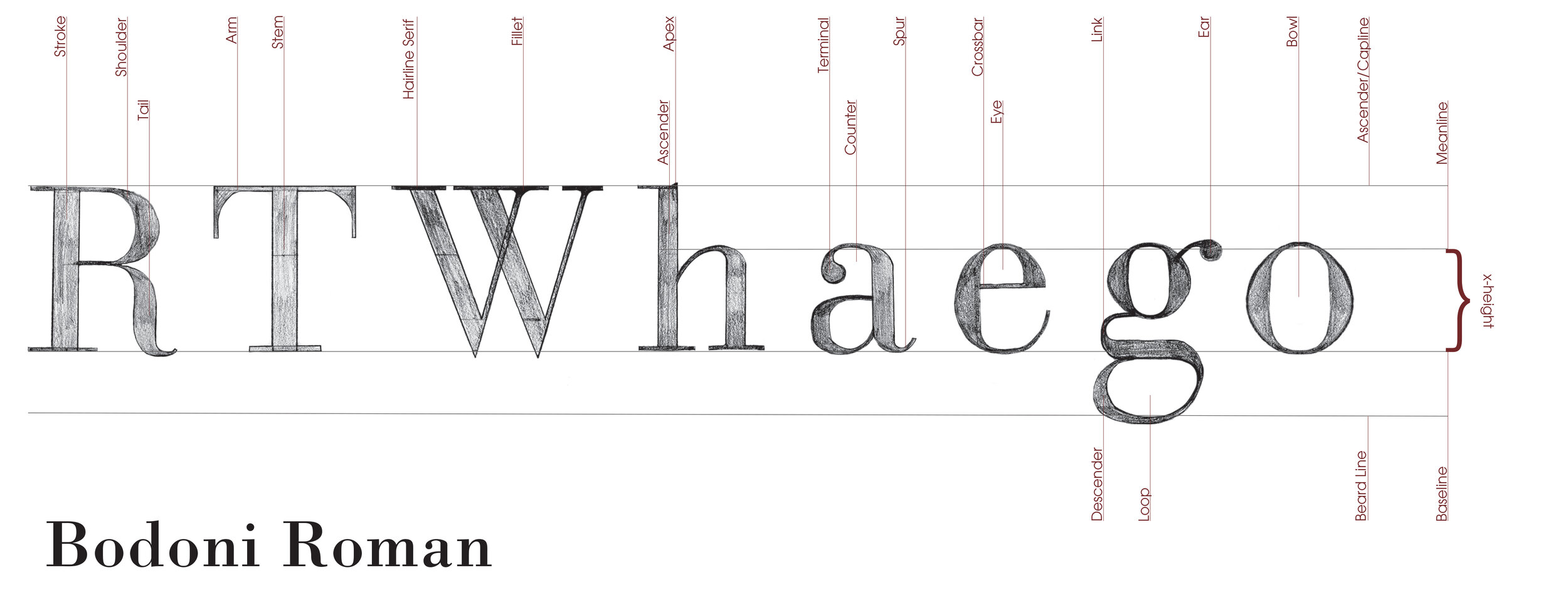
Together, the letters R-T-W-h-a-e-g-o are the composite of the key characteristics of a typeface. I was assigned Bodoni.
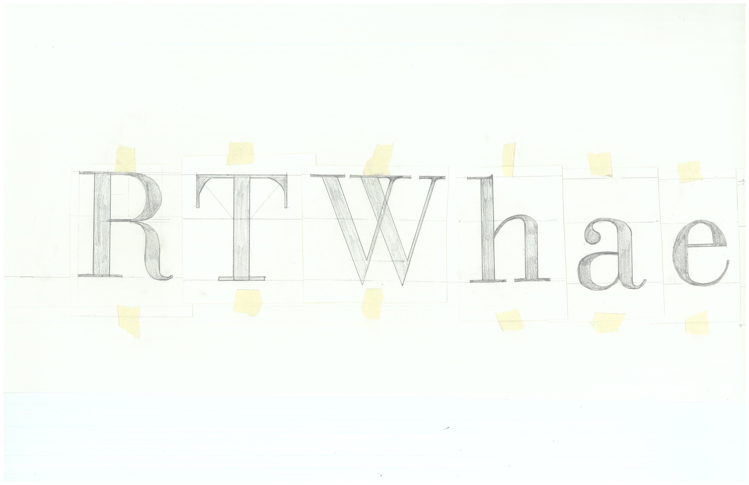
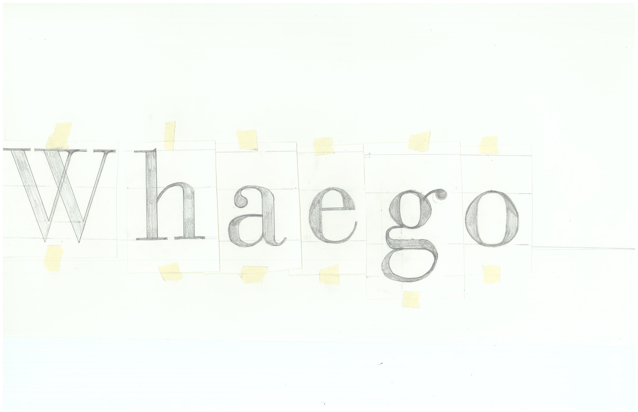
With our assigned typeface we were to draw the said letters twice the size of the exemplars as accurately as possible with the Baseline, Meanline (this gives you the x-height), Capline, Ascender, and Descender lines on each printed page. We then cut the letters out to establish the letter spacing (kerning) and tape the letters in place. After completing the freehand letterforms and letter spacing, we could use tracing paper or scan the drawing, open in Adobe Photoshop; clean up the letters if necessary and erase any lines and refine the letter-spacing further if necessary. In our final AI document, we needed to include the following callouts: Baseline, Ascender line, Capline (this may be the same line as the ascender line, label both), Meanline, descender line, x-height, Arm, Ascender, Bowl, Counter, Crossbar, Descender, Ear, Eye, Fillet, Hairline, Link, Loop, Serif (also label what type of serif, ie: Slab Serif), Shoulder, Stem, Stroke, Tail, and Terminal. Within the design, label the name of the typeface.
